PopCorners E-Commerce Website
How a helpful visitor experience got sales popping
Background
PopCorners is a nutritious and delicious popped-corn snack available for purchase on their website and in grocery and convenience stores across the country. Made with non-GMO corn grown on family farms, it’s a healthy, guilt-free treat that everyone can enjoy.
Challenge
PopCorners’ website had become technologically outdated, difficult to manage, and uninspiring to visitors. They urgently needed a new online presence to increase brand affinity and drive foot traffic to their resellers.
SERVICES
Strategy, User Experience (UX) Design, Responsive Website Design and Development, Copywriting
INDUSTRY
Food & Beverage
LINKS
Solution
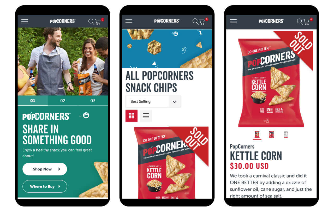
With a strong focus on storytelling, Rhythm created a dynamic new e-commerce website that brought the PopCorners brand to life.
Featuring a fun and playful look along with a delightful user experience, it resonated with audiences and got sales popping—both online and in stores.
Goodness From The Ground Up
When you reach for a bag of PopCorners, you’re choosing a wholesome snack made with nutritious ingredients sourced from family farms. That’s something to feel good about, and it’s a story worth sharing.
Throughout the new website we ensured copy and visuals aligned with this healthy and uplifting theme. PopCorners is tastefully portrayed as a fun, good-for-you treat that’s changing snack time for the better.
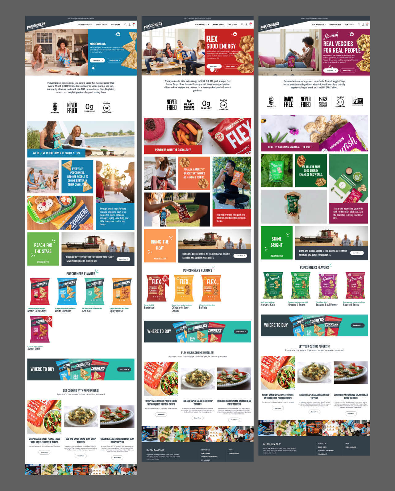
Consistency Across The Lineup
PopCorners and its three distinct product lines—PopCorner, Flex Protein Crisps and Flourish Veggie Crisps—had recently received packaging redesigns prior to the start of the new website project.
It was crucial to present the unique visuals, features and benefits of all three products while ensuring that the brand lineup remained cohesive.
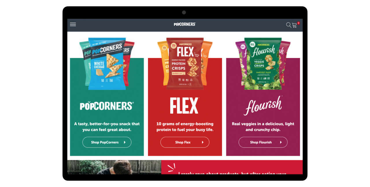
We accomplished this by creating dedicated feature pages using specific colors and messaging that aligned with each product—blue for PopCorners, the original low-calorie snack; red for Flex, the power-packed protein crips; and maroon for Flourish, the all-natural veggie crisps.
While each product appeals to different audiences, they’re all clearly under the PopCorners brand umbrella, with consistent font treatments, images and...
Doing One Better
PopCorners believes in “Doing One Better”—taking small steps every day that can make a big difference in the lives of others. This philosophy is a driving force for the brand and is prominently featured throughout the new website.
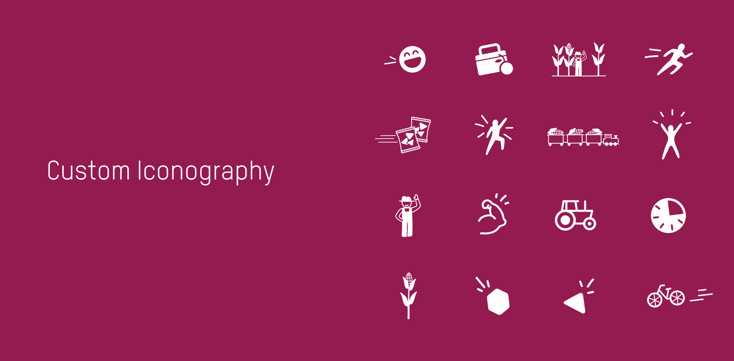
A dedicated “Our Story” page also highlights their support of Farm2Future, an advocate for local, sustainable food production. In addition, the unique story of how PopCorners are sourced and made is now told through an interactive graphic featuring rollover buttons that enhance audience engagement.
Designed To Pop
Paying homage to the “Instagram look,” the new site design features a series of colorful tiles, playful fonts and candid photography (many from fans and influencers).
With this vibrant styling, everything from product descriptions to customer testimonials feels energetic, inclusive and welcoming.