Sunsweet E-Commerce Website

How a seamless shopping experience grew online sales

Background

Sunsweet is the world's largest and most famous brand of dried tree fruits including prunes, apricots, mangos, and more. Since 1917 the cooperative has grown to represent nearly 200 grower-members with orchards throughout California – accounting for more than 25% of prune production around the world.

Challenge

While Sunsweet’s products are highly desirable, the same could not be said for their outdated website, which was uninspiring, difficult to navigate and frustrating to shop. They strongly needed a modern, dynamic online presence to help them share their unique story, better connect with health-conscious customers, and “sell without being salesy.”

SERVICES

Strategy, UX / UI Design, Responsive Website Design and Development, Email Design & Development, Copywriting

INDUSTRY

Food & Beverage

Solution

Rhythm spearheaded UX and web development, transforming Sunsweet’s website into a dynamic online shopping experience.

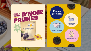
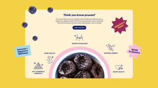
Visitors can now purchase delicious products with a few simple clicks while also learning more about Sunsweet, discovering the health benefits of prunes, browsing tasty recipes and more.

Getting Things Growing

Before creating any website—particularly one with e-commerce functionality—it’s important to do your homework. By conducting a comprehensive Discovery process, Rhythm determined that Sunsweet’s key audiences needed a robust website that quickly and easily met their needs—whether that was developing a better understanding of Sunsweet and its history, discovering the many products available to them, or learning new ways to incorporate Sunsweet’s nutritious products into their daily lives.

Most importantly, when audiences were ready to buy, the online shopping experience had to be effortless, organic, and natural—an experience that mirrors Sunsweet’s brand and products.

Everything on every page now leads to a conversion point—whether that’s to a product detail page, a product category page, or directly to the shopping cart itself. We now avoid pages that lead to dead ends.


Connecting With Customers

Sunsweet caters to a variety of online audiences including healthy snackers, older individuals with digestive needs, recipe seekers, and gift givers.

Our user experience teams considered their unique interests when developing the new website’s content and navigational structure.

To meet the needs of all audiences, we simplified the top navigation and made Sunsweet’s products the priority, followed by recipes, prune health benefits, and their story.

While many people visit the website for more than just shopping, our goal was increasing online sales while providing helpful information along the way.

To further encourage visitors to shop via the new website, a discount coupon is now prominently displayed above the logo and visible on all pages. A shopping cart icon is also featured at the top right of the navigation bar to allow purchases across the website.

It Starts With Search

A big initial focus for us was enhancing and improving the website’s search functionality. Whether a person is visiting for the first time or they’re already familiar with the site, the ability to quickly and easily find what they’re looking for is vital.

The search capability on the old Sunsweet website was very limited. Unless users knew the exact terms or product names they were searching for, the results would fail to display. So we developed a suggestive search functionality that instantly recognizes terms and phrases. The new search feature helps visitors quickly find the products they’re looking for and also suggests new ones. To place an emphasis on selling, Sunsweet products are always displayed first in the search results followed by individual website pages.

Home Sweet Home

Sunsweet’s home page acts as a jumping off point for the rest of the website. But we believed it could be so much more. Through a series of purposeful new modules, Sunsweet can now paint a much better picture of their brand and products.

Let’s Get Cooking

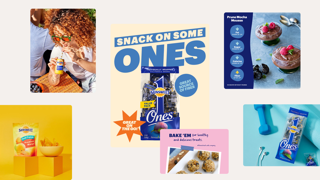
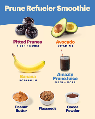
Many people discover the Sunsweet website when searching for recipes online. To capitalize on this organic search opportunity, a “Feel Good Recipes” module was created to showcase breakfast, dinner and dessert recipes using Sunsweet products.

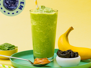
Each recipe includes attractive photography to increase engagement. Once a recipe is selected, visitors receive a list of ingredients, instructions and nutritional facts. The specific Sunsweet products used in each recipe are also displayed and can be added to an online shopping cart with one click. Now visitors can find exactly what they need and then easily checkout.

Being Resourceful

Sunsweet has a variety of helpful resources that have been developed by their nutritionists and registered dietitians. On their old website most of this information was only available in PDF form.

We proposed creating new content blocks to present this information within a dedicated resource section. This has made the content much more approachable for visitors and helps their organic search results since it's now discoverable by search engines (unlike PDFs).

Video assets from Sunsweet’s YouTube channel are also included with this section, bringing a powerful interactive element to the website. Sunsweet’s fans and followers can hear directly from registered dietitians, nutrition experts and even best-selling authors.

Seamless Shopping

The Sunsweet website now features consistent sitewide styling with an effortless and seamless new shopping experience. Visitors can browse the site and return to checkout when they’re ready. They can also sort by product type and price, specific packaging, nutritional features and more.