SmartStop Self Storage Website
How a frictionless experience kept customers moving
Background
SmartStop Self Storage offers personal and business storage solutions in both the U.S. and Canada. Known for outstanding customer service and competitive pricing, they’re committed to making the self-storage experience hassle-free and affordable.
Challenge
The storage industry is highly competitive so SmartStop continuously strives to stay ahead of the pack, especially on the digital front. Realizing that their website had become outdated, they urgently needed an improved online presence to maintain a competitive edge.

Analytics, Strategy, User Experience (UX) Design, Responsive Website Design and Development, Copywriting, SEO
Storage
Solution
Rhythm transformed the SmartStop website with a mobile-first approach highly focused on user functionality and experience.
SmartStopSelfStorage.com now provides a modern, easy-to-use experience that meets the needs of prospects and customers alike.
Today’s site visitors are able to quickly and easily solve their storage unit needs—from finding and reserving units to paying their bills online. Helpful resources such as packing tips, recommended supplies, special offers, and answers to FAQs are also available.
Unpacking Customer Insights
When it comes to storage spaces, one size does not fit all.
Websites are no different. To help us develop a winning strategy, we conducted a comprehensive discovery process that included interviews, user testing, and analytics assessment.
This background research gave us a better understanding of the need for a seamless user journey that also helps customers plan and prepare for upcoming moves.
A Complete Solution and Seamless Journey
Beyond an easy-to-use site experience with an industry-leading storage unit search and selection, there were opportunities to further improve the entire moving process.
To better serve current and future customers, SmartStop needed to provide a seamless user journey, from initial location search to final key return.
The primary purpose of visiting SmartStopSelfStorage.com is to find storage.
So we gave the customers what they want!
Find It Fast
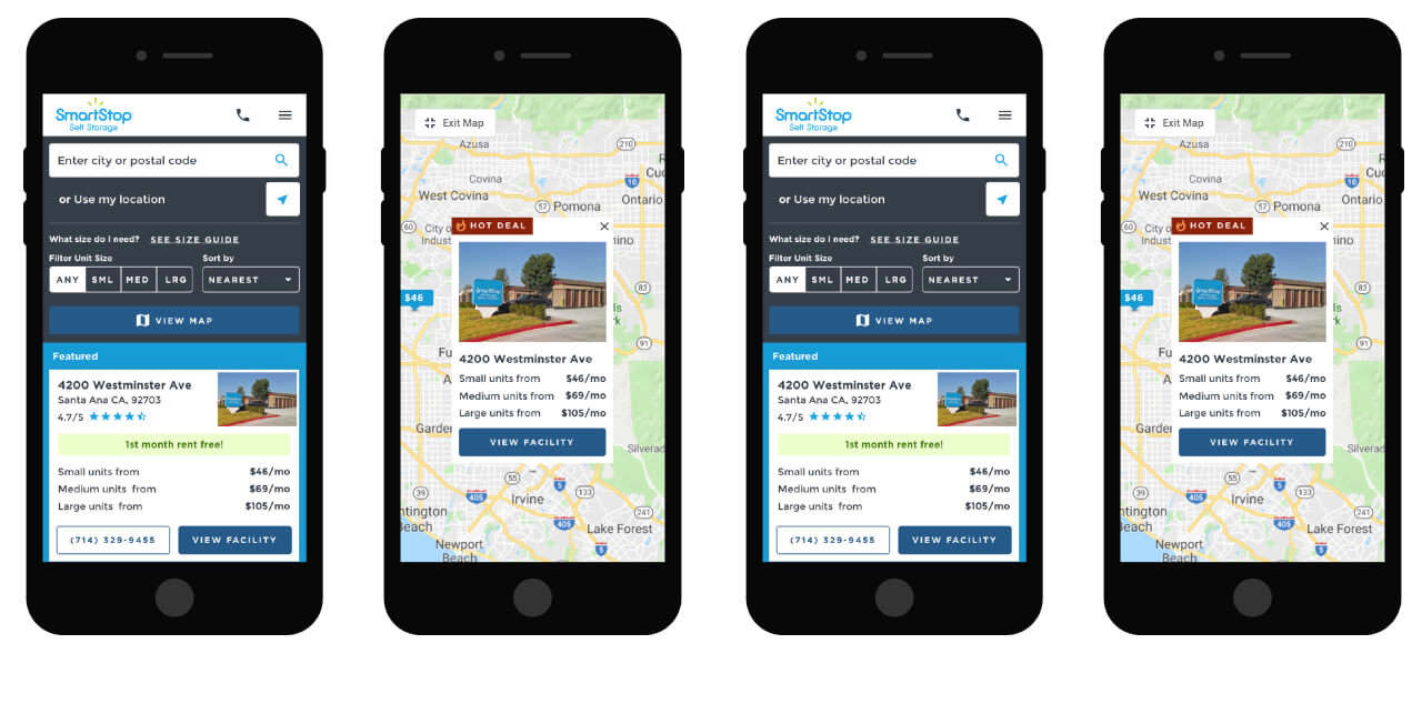
We developed a first-in-class search tool that allows users to view stores, inventory details and their location on a map simultaneously.
By making the search experience more useful, customers are now empowered to make better decisions and progress through the sales funnel more quickly.
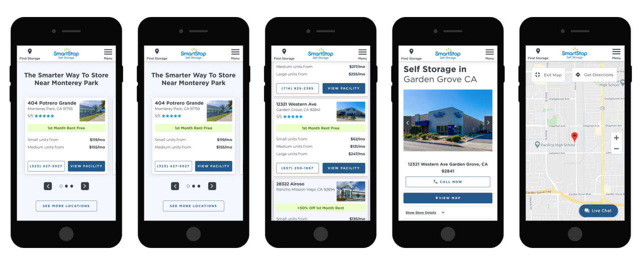
But finding the ideal storage location is just the start…
“What size do I need…?"
“What will fit my belongings?”
Our Solution: A Storage Guide that yields a unit size recommendation, as well as helpful videos that provide visual context to a unit's storage capacity.
“What supplies should I get?”
“What’s the smartest way to pack and move?”
Our Solution: A comprehensive list of moving tips to help customers prepare for the big day (starting 6 weeks out).
Information regarding available moving supplies from SmartStop is also easy to locate.
“Did my reservation go through?”
“Am I all set to show up Saturday with my truck full of items?”
“Was my payment received?”
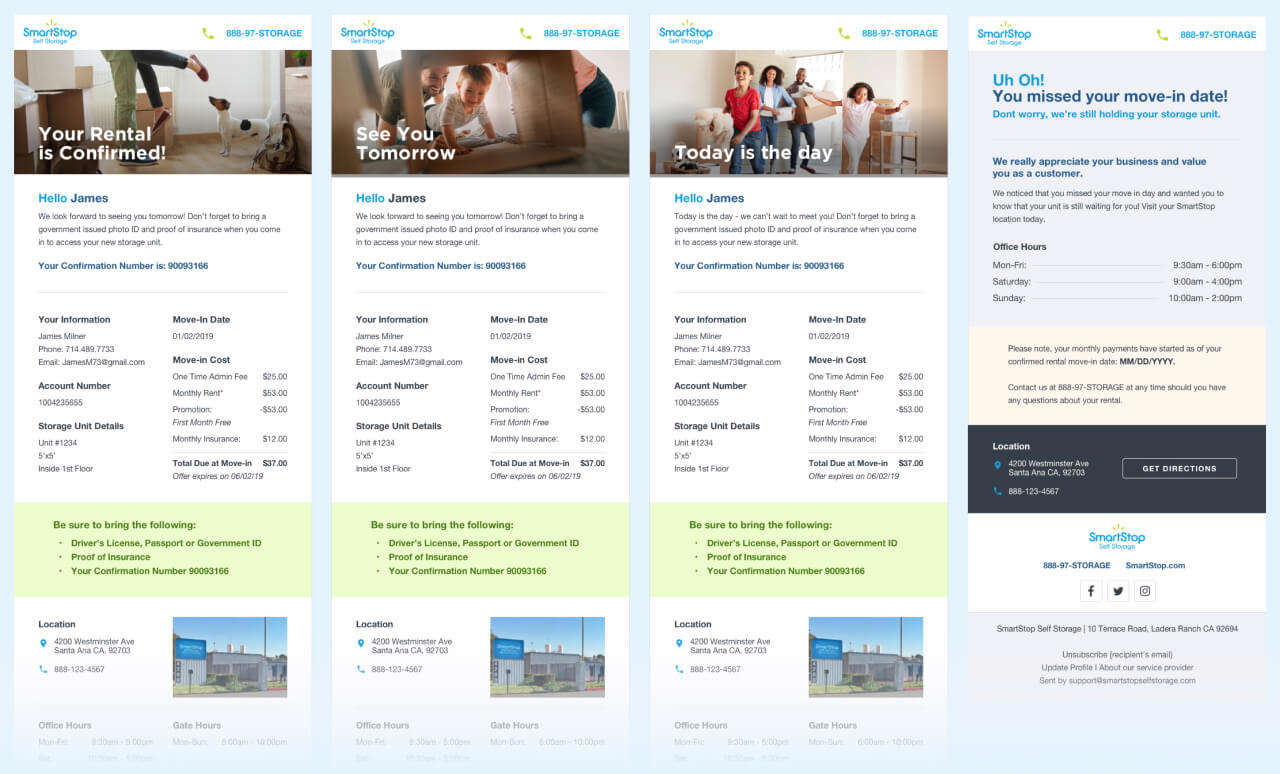
Our Solution: Clear, quick, concise communication via email, phone, and SMS text, throughout the user’s journey.
As reservations/rentals and transactions are processed, timely electronic communications including order confirmations and event reminders help reduce the need for calling customer service.
Design That Shines
Referencing SmartStop’s existing brand guidelines, we created custom icons to highlight storage unit features like climate control, no contract needed, and security cameras. Not only are the new designs aligned with previous icons, they’re instantly recognizable and understandable to site visitors.

Integrated Solutions
To display and manage SmartStop's comprehensive inventory and customer information, we integrated their CRM system (Centershift) with multiple layers of business logic to provide the most seamless user experience.
Additionally, Rhythm implemented Google Analytics and Google Tag Manager tracking to gain detailed insights on visitor engagement. This tracking helps SmartStop continually improve its user flow and market more effectively to potential customers.
Built For Mobile
With more than half of their web traffic coming from handheld devices (and trending upwards), it was imperative to provide a frictionless experience to customers on-the-go.
Taking a mobile-first approach, SmartStopSelfStorage.com was designed with an action-driven flow that makes it easy to find and secure storage from any device.
Go With The Flow
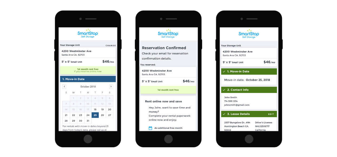
It was vital for the new website to have a high-converting reservation flow. Analyzing website data and performing user testing helped us design a new and streamlined reservation flow in 3 easy steps.
Since launching the new website, users are now converting 46% more often and 19.6% faster.
Communication Is Key
Rhythm also created a series of confirmation emails for SmartStop that keeps customers informed about upcoming moves. By providing personalized, timely messaging, SmartStop reduces anxiety, increases trust, and builds customer loyalty.
Very happy with the performance we are seeing! Please keep up the good work! Go team!
Beth Austin
Director of Marketing
SmartStop Self Storage

