US Storage Centers
Translating corporate vision into a creative rebrand
US Storage Centers (USSC) is a leading storage solution provider offering friendly service and stress-free experiences to its customers. After decades in the business, USSC wanted to reassess how they present themselves to the world and align their branding to reflect their purpose and vision.
- Category
- Storage
- Model
- B2B/B2C



Unboxing USSC’s new positioning and identity
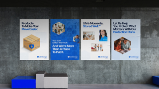
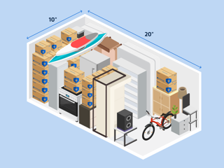
USSC turned to Rhythm to reimagine and reintroduce its presence in the storage space with a clean, forward-thinking design, both online and offline. Rhythm gave USSC’s visual identity a complete refresh, redesigning everything from the logo to signages with a modern, functional aesthetic. We also crafted brand guidelines that communicate the brand’s mission, vision, values, and style to all stakeholders. With the slogan Life Moments, Stored Well, we made sure this vision is integrated into the website and across all touchpoints.



Cutting through the clutter
Rhythm gave USSC’s visual identity a complete refresh, redesigning everything from the logo to signages with a modern, functional aesthetic. With the slogan Life Moments, Stored Well, we made sure these changes were reflected clearly on the website and across all touchpoints.

The Solution
We dug into their data, segmented their audience, and identified the best messaging approach to capture attention and drive action. We also gave their emails a fresh new look and feel—clean and inviting designs and punchy and approachable copy—to increase customer engagement.




Successfully unlocked
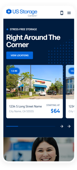
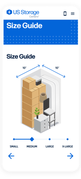
Locking down a clear brand identity and translating it consistently across offline and online platforms boosted USSC’s credibility. Its rebranded website, for one, saw a 27% growth in active users and a 15% boost in page views. Users are also spending more time on storage unit pages, suggesting they’re finding what they need—with a 12% increase in average engagement time and a 36% boost in “view item” events.
- Active Users Growth
- 27%
- Increased Page View
- 15%
- Increased Avg Engagement
- 12%