United Dental Partners Rebrand
How a tactical rebranding created alignment and accelerated growth
Background
United Dental Partners (UDP) owns dozens of dental offices in Illinois and Indiana that operate under the name All Family Dental & Braces. As an organization, UDP handles finance, operations, marketing, scheduling, human resources and related services so that their doctors can focus exclusively on providing high-quality, affordable dental care to patients.
The Challenge
While operating under a single umbrella, United Dental Partners and All Family Dental & Braces had no visual alignment or connection. With multiple logos and no brand standards in place, they lacked a consistent presence in the marketplace that clearly articulated the two brands via websites, advertisements, office signage, etc.

Content Strategy, Content (Design, Copywriting), Brand Strategy, Brand Development, Logo Design
Dental
A Tale of Two Brands
For all intents and purposes, United Dental Partners and All Family Dental & Braces appeared as two visually distinct brands in the marketplace, causing confusion among potential partners and employees who understood the organizations to be related.
As the parent company, United Dental Partners acted as a B2B brand. Meanwhile, All Family Dental & Braces was a public-facing B2C brand of dental offices. To complicate matters, United Dental Partners would periodically bring new dental practices into the fold under the All Family Dental & Braces brand. Beyond lacking consistency, both brands were visually unremarkable. Their logos featured dissimilar tooth icons, neither particularly memorable.
The font choices were also curious: United Dental Partners presented a more playful look with lowercase lettering, while All Family Dental & Braces appeared more serious in block type. This “law firm look” didn’t synch with a family friendly brand.
Solution
A distinctive brand strategy and identity conveying a family friendly company that provides high-quality, affordable dental care to patients.
Championing a “branded house” approach, Rhythm visually unified United Dental Partners and All Family Dental & Braces, and better positioned the organizations for future growth and geographic expansion.
Creating an Icon
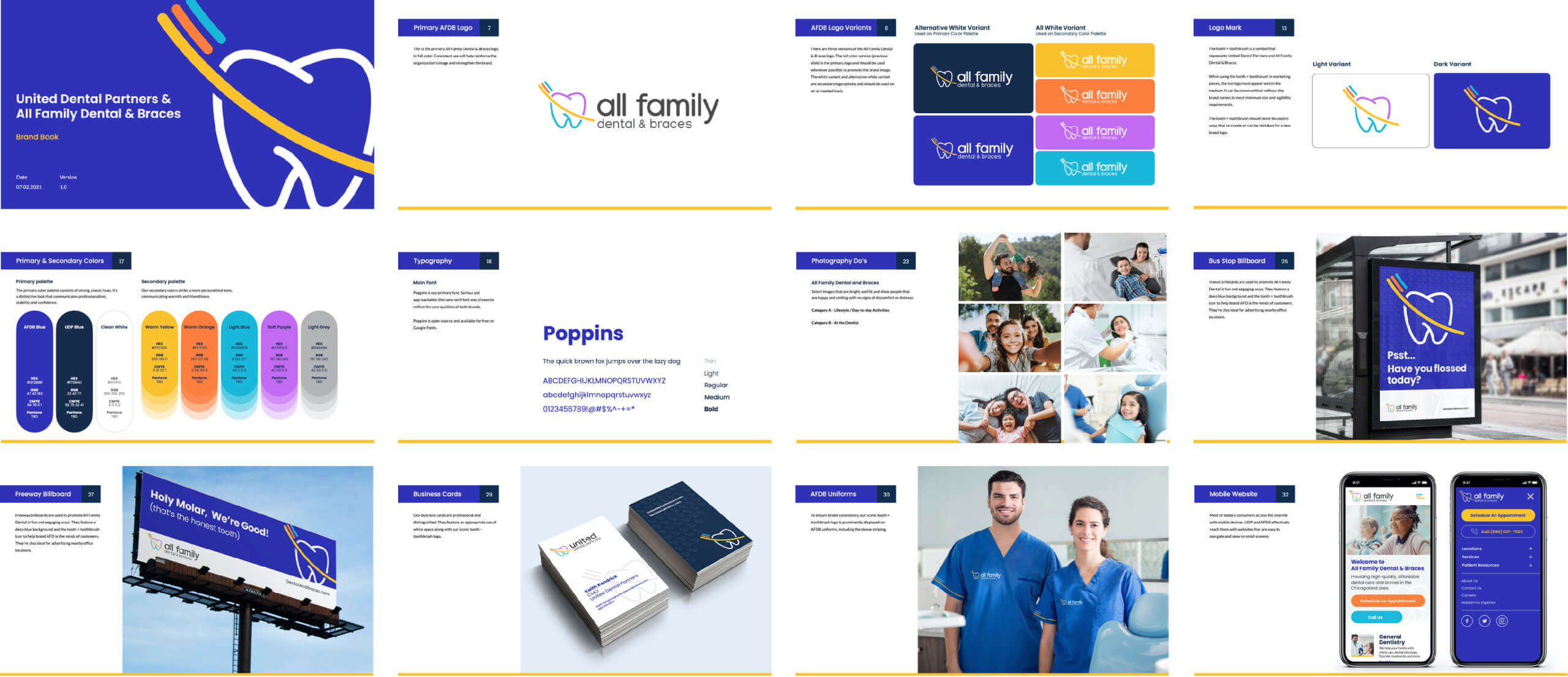
To establish consistency between the two brands, Rhythm’s design team created a unique and memorable tooth + toothbrush icon to be shared by both. Stylish and playful, it injects life into both brands while still remaining professional in appearance. The icon also makes both brands instantly recognizable as dental organizations.
We also decided to give both brands the same text treatment, further aligning the two. A serious yet approachable sans-serif font reflects their core qualities while lowercase lettering was chosen for its welcoming and friendly nature.

When needed, the new icon was designed to stand alone without text, bringing instant brand recognition across a variety of media—from billboards and bus stops to flyers and business cards.
It can also be leveraged as a background texture to further extend the brand…
Selecting Impactful Colors
Color plays an important role in branding and marketing. In fact, customers often gain their first impressions about a company from its hues. Acting as more than just a visual aid, colors convey emotions, feelings and experiences.
Most dental organizations stick to a narrow band of blues and greens. We wanted both brands to avoid this sea of sameness by embracing a broader color spectrum.
While classic blues anchor the primary palettes to convey professionalism and stability, secondary colors range from warm yellow to soft purple, communicating warmth and friendliness.
Finding Unique Voices
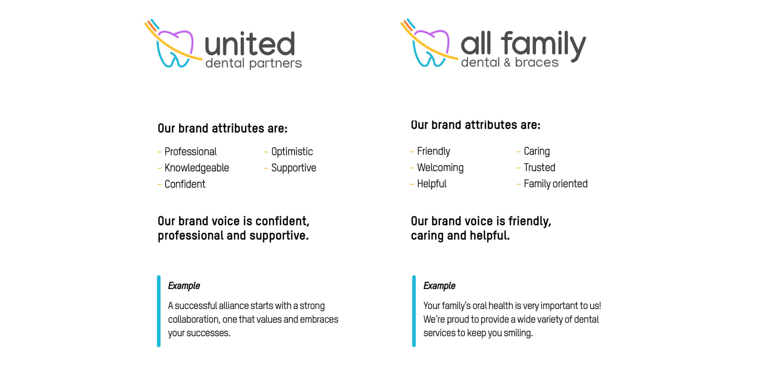
To guide future content development (websites, ads, collateral, emails, etc.), we created brand attributes and brand voices for both organizations. Brand Attributes are the core values that define the nature of organizations, and they act as personality traits in the minds of customers. Brand Voice is how the character of an organization comes through in words, both written and spoken.


