Target
Target's new online brand presence really changed in 2012, they released some great apps and completed a rebuild of their website and made it responsive. They simplified their brand and created a really good mobile experience. They simplified their UI, mixing large bold typography, great product photography and elegant javascript effects (check out the wedding registry section on the desktop site). 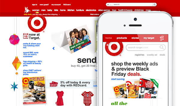
Microsoft
Microsoft launched a great responsive website in November. It's fully responsive from desktop to mobile and the clean, simple user interface is appealing to the eye and propels Microsoft leaps and bounds over the competition when it comes to providing users with a well-designed mobile experience. Apple needs to follow suit with a redesign and soon as their online brand is becoming more outdated by the minute! Kudos to MSFT for taking a giant leap forward with their brand and products, I look forward to what they have planned for the future. 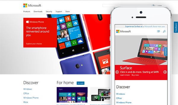
Mini Cooper
Mini provides the best experience in terms of major car makers' mobile site designs with its crisp-looking, fast-loading mobile experience. They have really blown away the rest of the car companies when it comes to design and usability. While there is room for improvement (think car builder), they have delivered a great mobile automotive experience. 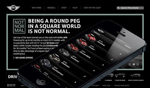
Zappos
Always a brand to emulate, Zappos' mobile website is one other brands should take notice of. Their mobile site offers a great representation of their full desktop website, making it easy for a user to browse their product offerings and make purchases. Their images look very crisp on a retina display mobile device and I love their motto "Fun and a Little Weird". Zappos is a great brand doing great things in the online mobile arena. 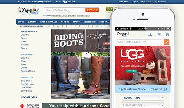
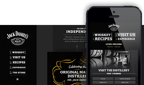
Jack Daniels
Mmm...whiskey. Jack Daniels has launched a stunningly great new responsive website! They do a great job of blending vintage typography and images with new html5/javascript effects. Their story timeline is a great concept that flows perfectly into a mobile setting. This experience or design strategy definitely began with mobile technology in mind. I believe that this is the future of website design -- designing with mobile and tablet in mind first and then figuring out what the desktop version should look like. A toast to JD and a job well done! 