
We live in an interesting time. Gone are the days when websites had to be designed for a single screen size.
Today, digital designers need to consider how the overall design and content will look and function on multiple screen sizes and mobile devices. Clients expect their websites, custom landing pages, emails, etc. to render and function properly on various desktop computer monitors, laptops, tablets and smartphones.
With different screen size options continuing to expand and new mobile gadgets making their way to store shelves every day, digital designers have their jobs cut out for them. Even if we were able to design and test for all current devices and screens, by the time we would launch the website, custom landing page or email, new devices with new screen specs would most likely have hit the market.
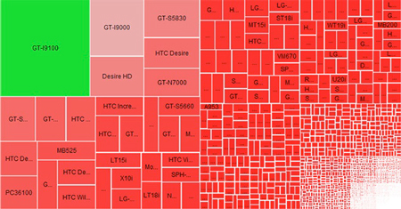
The below graphic shows the screen size fragmentation of Android devices currently on the market. (View image source)
So how do digital designers account for all these different screen sizes? When you design for multiple screen sizes, it’s best to pick a starting point. From there, you can have your design scale up or down. There are multiple ways to achieve this. Maybe you have heard about responsive or adaptive design. While this approach is anything but new (we can remember websites that scaled up to 100% of the browser width in the late 90s and early 2000), responsive design takes a bit different approach.
With today's new possibilities in CSS and HTML, websites can be designed to adapt to any screen size or resolution. The concept is to design and test once, rather than design, plan and develop multiple sites.
There are definetly advantages to this approach -- both time and cost. While it takes more time to approach a website design with a responsive framework, it's more cost efficient than building a full site and a mobile site. But, it should be noted that planning and designing a reponsive website also requires a totally different approach. There needs to be a great deal of collaboration between designer and developer to determine how the site design, layout and content change for different platforms. Often times, this requires all involved to take a hard look at the content and determine what is and is not needed for mobile versions.
At Rhythm we can help you optimize your website, custom landing pages and emails for mobile. Give us a shout by calling (949) 783-5000.


