Tiny Changes To CTA Buttons Can Bring HUGE Results
CTA buttons are everywhere online – from website contact forms to landing pages to banner ads. In fact, if a conversion needs to take place on the web, you can almost guarantee that a CTA button will be there to (hopefully) make it happen. But like most common things in this world (even the virtual one), CTA buttons tend to get overlooked. And this is a huge mistake for marketers to make. After all, CTA buttons are often the difference between a campaign’s failure or success. Fortunately, a few tweaks can be all that it takes to guarantee the latter.
Now before continuing, I’d like to make one thing clear: CTA buttons do not exist in a vacuum – they are but one piece of a bigger puzzle along with graphics and copy. To achieve real success all three must fit together, with the CTA button acting like the exclamation point at the end of a good sentence. That said, for this post we’ll assume everything else is hunky-dory while focusing specifically on the CTA button itself.
So back to the button…
It’s becoming increasingly apparent through research and testing that small changes to your CTA button can bring big results. These changes come in three distinct areas: visuals, placement and messaging. If you master all three, there will be increased conversions for thee.
Get The Look
First things first, a CTA button is a button. It’s not a hyperlink or a text bloc. It’s a button. People are used to the way they look and know what to do when they see them. There are plenty of ways to get creative when it comes to design, don’t make recreating the CTA button one of them. Here, there be dragons!
That said, the way your typical CTA button looks does matter, but probably not in the way you’re thinking. It turns out that there is no specific color that converts best. However, what does make a difference is the color variation between your CTA button and the rest of the design. It’s vital that your button stands out – not that it’s red or orange.

In this example, Constant Contact uses a blue CTA button that contrasts nicely with the rest of the design.
Go With The Flow
Once you have a CTA button that looks like a button and clearly stands out, the next step is properly placing it within the design. Your CTA button should be in tune with the users’ visual flow. Eyes move in predictable paths, so keep your CTA button aligned with your headline and body copy – from top to bottom. Your audience should always be 100% certain about where to click – if they aren’t your conversions will suffer!

Here, Medium ( a blog-publishing platform) does a great job of going with the flow. Headline, body copy, CTA button. Clear, concise and clickable.
Phrase The Roof
If you want to blast your conversions through the roof, get your phrasing right. Often the tiniest tweaks to your CTA verbiage can make a HUGE difference. While there are some good rules of thumb – use verbs, get personal, avoid “submit” for God’s sake – the best course of action is to A/B test like it’s going out of style. Every audience is different and what works well for one may flop for another. The only way to know is to test.

The only difference between the design examples (above and below) from Dressipi.com is the CTA button verbiage. By changing "SIGN UP NOW" to "SHOW ME OUTFITS I'LL LOVE" they increased clicks by 123.9% !

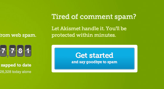
Also, don’t be afraid to experiment with length. It’s typically best to keep your verbiage short, but if you can’t, consider banking it. All that really matters is connecting with your audience. If you can incite action in three words, great. If it takes 10, so be it.

Here, Akismet banks it.
In conclusion, never neglect your CTA buttons. These little guys are a bigger deal than you think! And just by mastering your visuals, placement and messaging, you should always be able to keep them clicking.